
Witajcie!
Hello!
Hello!
Dziś na pewno nie jest pechowy dzień, chociaż to piątek i 13 dzień maja!
W Piaskownicy zapraszamy na kolejne kreatywne, kolorowe wyzwanie :-)
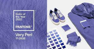
Nasze kolory w tym miesiącu to very peri (fioletowy) i niebieski
Today is definitely not an unlucky day, although it is Friday and May 13th!
In Piaskownica, we invite you to another creative, colorful challenge :-)
Our colors this month are very peri (purple) and blue
In Piaskownica, we invite you to another creative, colorful challenge :-)
Our colors this month are very peri (purple) and blue

W tym roku eksperci ogłosili, że kolorem roku został Very Peri. To niebiesko-fioletowy odcień z czerwonymi akcentami. Barwa ta ma wyzwolić w nas kreatywność oraz pobudzić twórczego ducha. Jak właściwie wygląda? Dokładnie taki odcień mają kwiaty barwinka, może więc być Wam dobrze znany. Barwę o numerze 17-3938 zainspirowały pandemia COVID-19 i wirtualna rzeczywistość, w tym Metaverse oraz NFT. Pierwsze zjawisko wymusza konieczność zmiany dotychczasowych sposobów działania, drugie sygnalizuje, że nowy świat już tu jest. Do wkraczania w tę nową rzeczywistość ma zachęcać Very Peri. Jak podaje Instytut Pantone, nowa barwa symbolizuje beztroską pewność siebie oraz śmiałą ciekawość. – Żyjemy w czasach transformacji – podkreślają przedstawiciele marki, a dyrektor wykonawcza Pantone Color Institute, Leatrice Eiseman w rozmowie z portalem CNN dodała: – Stworzenie nowego koloru było dla nas ważne, ponieważ mamy nową wizję świata.
This year, experts announced that Very Peri was the color of the year. It's a bluish-purple shade with red accents. This color is to free our creativity and stimulate the creative spirit. What does it actually look like? This is exactly the shade of periwinkle flowers, so you may well know it. The color number 17-3938 was inspired by the COVID-19 pandemic and virtual reality, including Metaverse and NFT. The first phenomenon forces the necessity to change the current methods of operation, the second signals that the new world is already here. Very Peri is supposed to encourage to enter this new reality. According to the Pantone Institute, the new color symbolizes carefree self-confidence and bold curiosity. - We live in a time of transformation - emphasize the representatives of the brand, and the CEO of Pantone Color Institute, Leatrice Eiseman in an interview with CNN, added: - Creating a new color was important to us, because we have a new vision of the world.
Barwa niebieska - classic blue – jedna z addytywnych barw podstawowych, na kole barw dopełnia barwę żółtą. Zakres światła niebieskiego ma długość fali od ok. 420 do ok. 490 nm. Barwa niebieska ma także swoją ciemniejszą odmianę. Początkowo do XIV wieku w języku polskim „niebieski” oznaczało „przynależny do nieba”, a dopiero później wyraz ten stał się osobnym określeniem barwy niebieskiej, charakterystycznej dla koloru nieba.
Blue - classic blue - one of the additive primary colors, completes the yellow color on the color wheel. The range of blue light has a wavelength of approximately 420 to approximately 490 nm. The blue color also has its darker type. Initially, until the 14th century, in Polish, "blue" meant "belonging to heaven", and only later became a separate term for the blue color, characteristic of the color of the sky.
Blue - classic blue - one of the additive primary colors, completes the yellow color on the color wheel. The range of blue light has a wavelength of approximately 420 to approximately 490 nm. The blue color also has its darker type. Initially, until the 14th century, in Polish, "blue" meant "belonging to heaven", and only later became a separate term for the blue color, characteristic of the color of the sky.


Pamiętajcie, że główną ideą tych wyzwań jest KONTRAST! Sama zabawa polega na zestawieniu ze sobą dwóch kolorów (ich odcieni), z których należy stworzyć pracę w dowolnej technice i formie. Nie ograniczajcie się tylko do papieru 😉 Dopuszcza się tu, podobnie jak we wszystkich wyzwaniach kolorystycznych, użycie niewielkiej ilości bieli i/lub czerni.
Poniżej kolory w interpretacji naszego DT na materiałach sponsora wyzwania.
And here’s what our DT members have come up with:


Na Wasze prace czekamy do 12 czerwca.
We are waiting for your works until June 12.
Bardzo ciekawe połączenie 😊
OdpowiedzUsuń