
Cześć! / Hello!
Pora na naszą kolejną zabawę kolorami -
w tym miesiącu mamy dla Was ciepłą paletę kolorystyczną.
It's time for our next play with colors -
this month we have a warm color palette for you.
ZŁOTY + KREM / BEŻ
GOLD + CREAMY/ BEIGE

Forma, technika oraz temat pracy są dowolne.
The form, technique and topic of the work are free.
Barwa złota (złoto) – barwa, powstająca w wyniku połączenia barwy żółtej z pomarańczową. Kodem barwy w systemie X11 jest FF D7 00, a w RGB 255 215 0[2]. Ponieważ na monitorze komputera nie można wyświetlić fluorescencyjności ani efektu błyszczenia się metali, kolor ten jest wyświetlany jako połączenia barwy żółtej z pomarańczową.
Złoto to zaufanie, symbol boskiej mocy i mądrości. W samej swojej istocie reprezentuje wzniosłość ideałów, oświecenie umysłu i ducha. Czyste złote światło wskazuje nam drogę własnego rozwoju i kierunek osobistych przemian.
Złoto to zaufanie, symbol boskiej mocy i mądrości. W samej swojej istocie reprezentuje wzniosłość ideałów, oświecenie umysłu i ducha. Czyste złote światło wskazuje nam drogę własnego rozwoju i kierunek osobistych przemian.
*50. rocznica zawarcia związku małżeńskiego jest nazywana „złotymi godami”.
* Najwyższym wyróżnieniem za osiągnięcia w wielu dziedzinach jest złoty medal.
*Jednymi z nagród filmowych są Złoty Glob i antynagroda Złota Malina.
Gold color (gold) - color resulting from the combination of yellow and orange. The color code in the X11 system is FF D7 00 and in RGB it is 255 215 0 [2]. Since fluorescence and metal glitter cannot be displayed on the computer monitor, the color is displayed as a combination of yellow and orange.
Gold is trust, a symbol of divine power and wisdom. In its very essence, it represents the sublime of ideals, the enlightenment of mind and spirit. Pure golden light shows us the path of our own development and the direction of personal changes.
* 50. the anniversary of marriage is called "golden festivities".
* The highest distinction for achievements in many areas is the gold medal.
* One of the film awards are the Golden Globe and the Golden Raspberry anti-prize.
Pamiętajcie,
że główną ideą tych wyzwań jest KONTRAST! Sama zabawa polega na
zestawieniu ze sobą dwóch kolorów (ich odcieni), z których należy
stworzyć pracę w dowolnej technice i formie. Nie ograniczajcie się tylko
do papieru 😉 Dopuszcza się tu, podobnie jak we wszystkich wyzwaniach
kolorystycznych, użycie niewielkiej ilości bieli i/lub czerni.
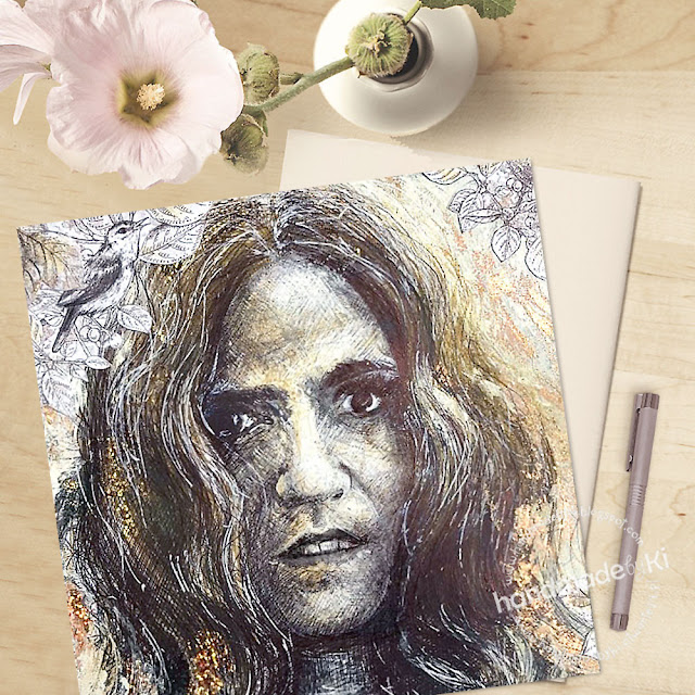
A to inspiracje naszego zespołu:
And these are the inspirations of our team:


Na Wasze prace czekamy do 12 stycznia. Powodzenia :)
The challenge runs until 12th of Januar. Good luck!
Brak komentarzy:
Prześlij komentarz
dziękujemy że jesteś z nami :) baw się dobrze w naszej "piaskownicy" - załoga AP